Introduction
Orange is a general-purpose data mining and machine learning tool.
In this guide, we will introduce how to use it via the GUI. There is also a Python library available.
You can get a feel for the GUI by looking at https://orangedatamining.com/screenshots/.
System Requirements
The system used for this review is as follows:
- Mac OS
- 1.4 GHz quad-core Intel Core i5
Installation & Build Instructions
Download the appropriate package for your operating system from the download page.
In this case, I downloaded “Orange for Intel” for macOS.
How to Check CPU on macOS
From the Apple icon in the top-left of the menu bar, select “About This Mac.”
The “Processor” entry will indicate whether you have Apple Silicon or Intel.
Getting Started
Preparing the Input File
Before using Orange, you need to prepare your input file.
Supported formats include:
| Basket | .basket .bsk |
|---|---|
| Comma-separated | .csv .csv.gz .gz .csv.bz2 .bz2 .csv.xz .xz |
| Excel | .xls .xlsx |
| Orange-trained data | .pkl .pickle .pkl.gz .pickle.gz .gz .pkl.bz2 .pickle.bz2 .bz2 .pkl.xz .pickle.xz .xz |
| Tab-separated | .tab .tsv .tab.gz .tsv.gz .gz .tab.bz2 .tsv.bz2 .bz2 .tab.xz .tsv.xz .xz |
You can also fetch data directly from URLs, such as shared Google Spreadsheet links.
Input files generally follow the convention of “one header row + data rows”.
In Orange, you can add metadata such as “data type” and “role”.
Roles are:
| target | Main (dependent) variable column |
|---|---|
| meta | Identifiers or columns not used in processing |
| skip | Columns to ignore |
| feature | The main data columns |
Data types are:
| numeric | Numeric data |
|---|---|
| categorical | Categorical data |
| datetime | Date/time data |
| text | Text data |
Although you can set roles and data types later in Orange, you may also specify them in the input file.
Be aware that Orange uses slightly different shorthand labels:
Roles:
| c (class) | target |
|---|---|
| m (meta) | meta |
| i (ignore) | skip |
| (blank) | feature |
Data types:
| c (continuous) | numeric |
|---|---|
| d (discrete) | categorical |
| t (time) | datetime |
| s (string) | text |
There are two ways to specify them in your input file:
**1st method**: Write “data type” in the second header row and “role” in the third header row. (Tab‑delimited example follows.)
sepal length    sepal width    petal length    petal width    iris    comment
c   c   c   c   d   i
                class
5.1 3.5 1.4 0.2 Iris‑setosa first‑element
…
**2nd method**: Prepend each header field with “role” (lowercase) and “type” (uppercase), separated by “#”. (Tab‑delimited example below.)
C#sepal length  C#sepal width  C#petal length  C#petal width  cD#iris i#comment
c   c   c   c   d   i
                class
5.1 3.5 1.4 0.2 Iris‑setosa
…
Be careful—when switching between methods, the row ordering differs.
How to Use Orange
Let’s look at how to load data into Orange and visualize it. Launch Orange.
In the “Welcome to Orange” dialog, select “New”.
Now add some widgets. There are three main methods:
- Click on a widget in the left panel
- Drag and drop a widget from the left panel into the workspace
- Click on the empty workspace area and select from there
After adding the core “File” and “Data Table” widgets, your workspace should look something like this:
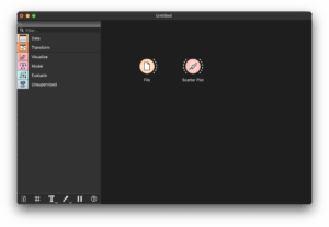
You can also search widgets via the “Filter…” box for quick access.
Each widget has dashed ports: inputs on the left, outputs on the right.
For example, connect the right port of “File” to the left port of “Data Table” to pass data from File to Data Table.

If you connect to an empty workspace area, it opens the widget picker and auto‑connects it.
Data Visualization
Let’s process some real data—for example, the famous Fisher’s Iris dataset.
(This dataset contains four measurements—sepal length, sepal width, petal length, petal width—for 50 samples each of three Iris species.)
Double‑click the “File” widget and select “datasets/iris.tab” from the file dialog, which yields a screen like this:
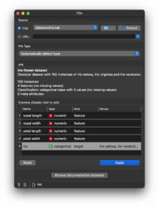
The first two lines in “Info” come from reading “datasets/iris.tab.metadata”.
The rest shows dataset details such as “150 instances”.
The “Columns” section lists the name, data type, and role inferred from the header.
If Orange auto-assigned the wrong role (e.g. misidentifying the target), you can fix it here.
If using the same dataset frequently, consider connecting to a “Save Data” widget to save your settings.
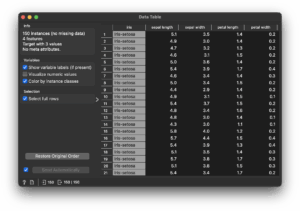
Now double‑click “Data Table” to view your data as follows:
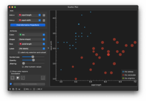
You can also connect “Data Table” to a “Scatter Plot” widget. Double‑clicking it shows a scatter plot.
By default, it plots the first two “meta” attributes (sepal length vs. sepal width).
Change “Attribute → Size” to “petal length” to adjust the plot:
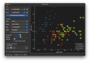
Select rows 26–75 in the Data Table, and observe how the scatter plot updates to only show those selections:
Finally, double‑click the line linking Data Table and Scatter Plot:
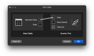
Delete that connection, then reconnect “Data” to “Data” to restore the full dataset visualization.
Paint Data Widget
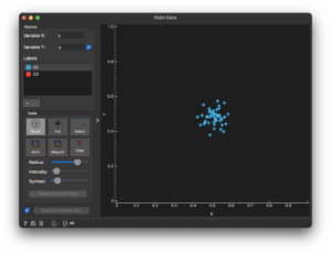
This widget lets you generate data points around clicked areas, allowing you to build synthetic datasets.
You can combine this with loaded data and experiment with clustering, algorithms, etc.
Add‑Ons
Widgets not included by default are provided via add‑ons.
You can find and install them through Options → Add‑Ons… in the menu bar.
After installing, restart Orange to enable them.
Tutorial Videos
The official tutorial playlist Getting Started with Orange is available.
These are geared toward beginners, so if you’ve never done any data analysis, they may be worth browsing.
As Orange is GUI‑based, much can be learned by experimentation—especially with the widget search feature.
The 20 videos are broadly categorized as:
- 01–04 and the first half of 08: Intro to using Orange (covered above)
- 05–07, 09–13, 20: Data analysis on numerical datasets
- Second half of 08: Bioinformatics add‑ons
- 14–15: Image mining add‑ons
- 16–19: Text mining add‑ons
Conclusion
This brings us to a basic introduction to Orange.
Several widgets not covered here—such as clustering and evaluation—require deeper algorithmic understanding. Refer to documentation or the Orange widget catalog for more details.